2022 ✴ User research, Card sorting, Prototyping
Discovery and recommendations for Trada Market

01 Context
This project is part of Intuit’s Innovation Week, where we get to spend a week to pick one problem, ideate solutions for it, and validate with users.
I teamed up with a product manager and another product designer to work on Trada, an online wholesale marketplace where retailers can source products from local brands.
02 Problem
While retailers on Trada browse products regularly, less than half (42%) add products to their cart and even less (27%) complete the checkout process. We set out to find why by interviewing users.
03 Discovery
Here’s what we learned after initial interviews:
- Retailers hesitate to try new brands because they’re not sure about the brand’s reliability and authenticity
- High minimum order quantity deter retailers from trying new products, as they’re not yet sure if it will sell well
- Retailers felt they had seen everything on Trada as they keep seeing the same products again and again
The last one is a particularly interesting insight that we felt we could focus on for the timeframe we’re given.
03 Ideation and testing
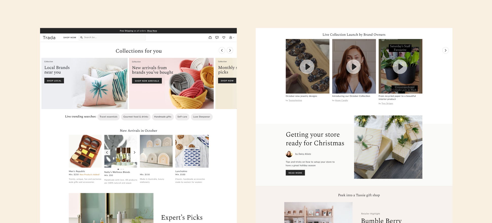
Homepage

This is the first thing retailers see upon signing in to Trada. We wanted to update the content on this page to make it:
- Personalized: a section called ‘Collections for you’ shows products related to previously bought products and brands, as well as users’ location.
- Dynamic: we want to add sections that are constantly changing, so users see something new every time they browse, in the form of ‘Trending searches’ and ‘New arrivals’.
- Editorial: such as Curated picks by experts and a showcase where we write about a specific brand. This can be updated on a monthly basis.
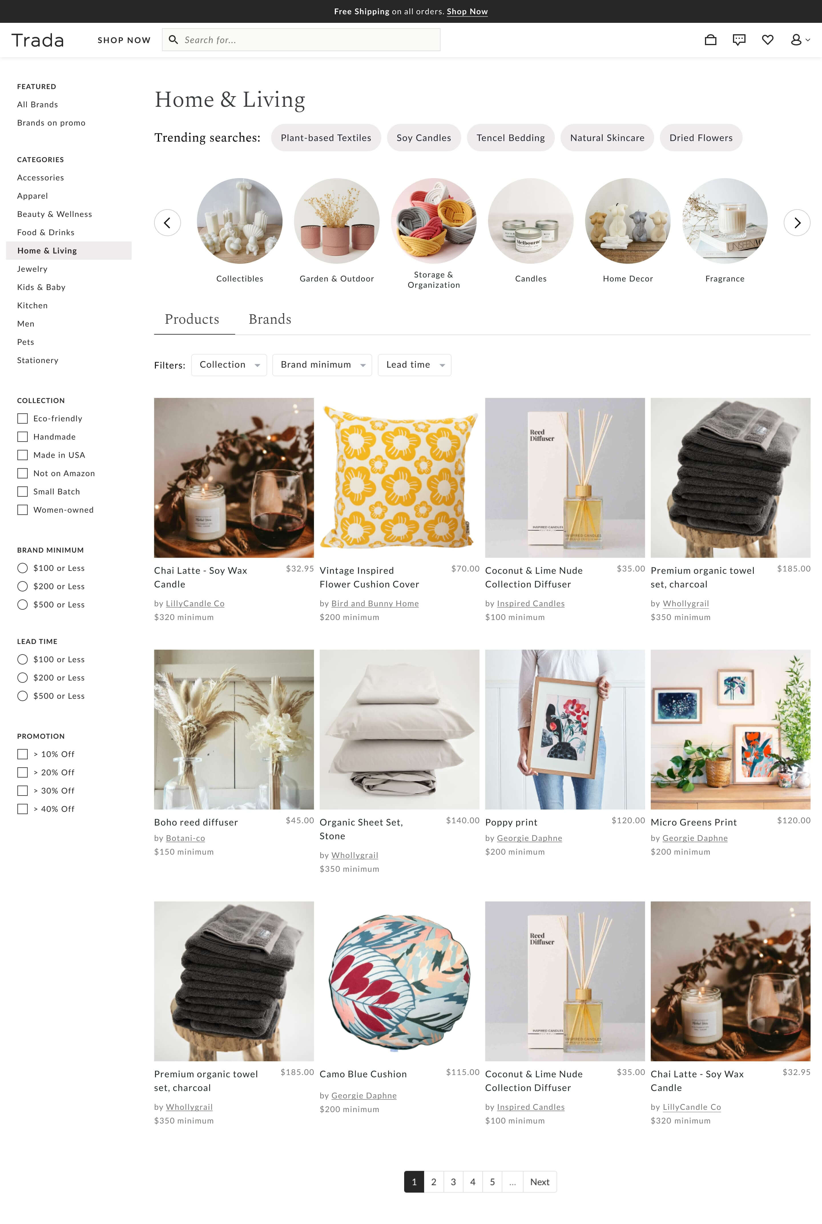
Categories

This is what users see when they click into a specific category. Here we added:
- Trending searches to show what other users search for under the category.
- Subcategories to help users filter the listings. This can also provide ideas on new product lines that retailers may not have previously thought of.
- An option to toggle between products and brands to provide users control over how they browse.
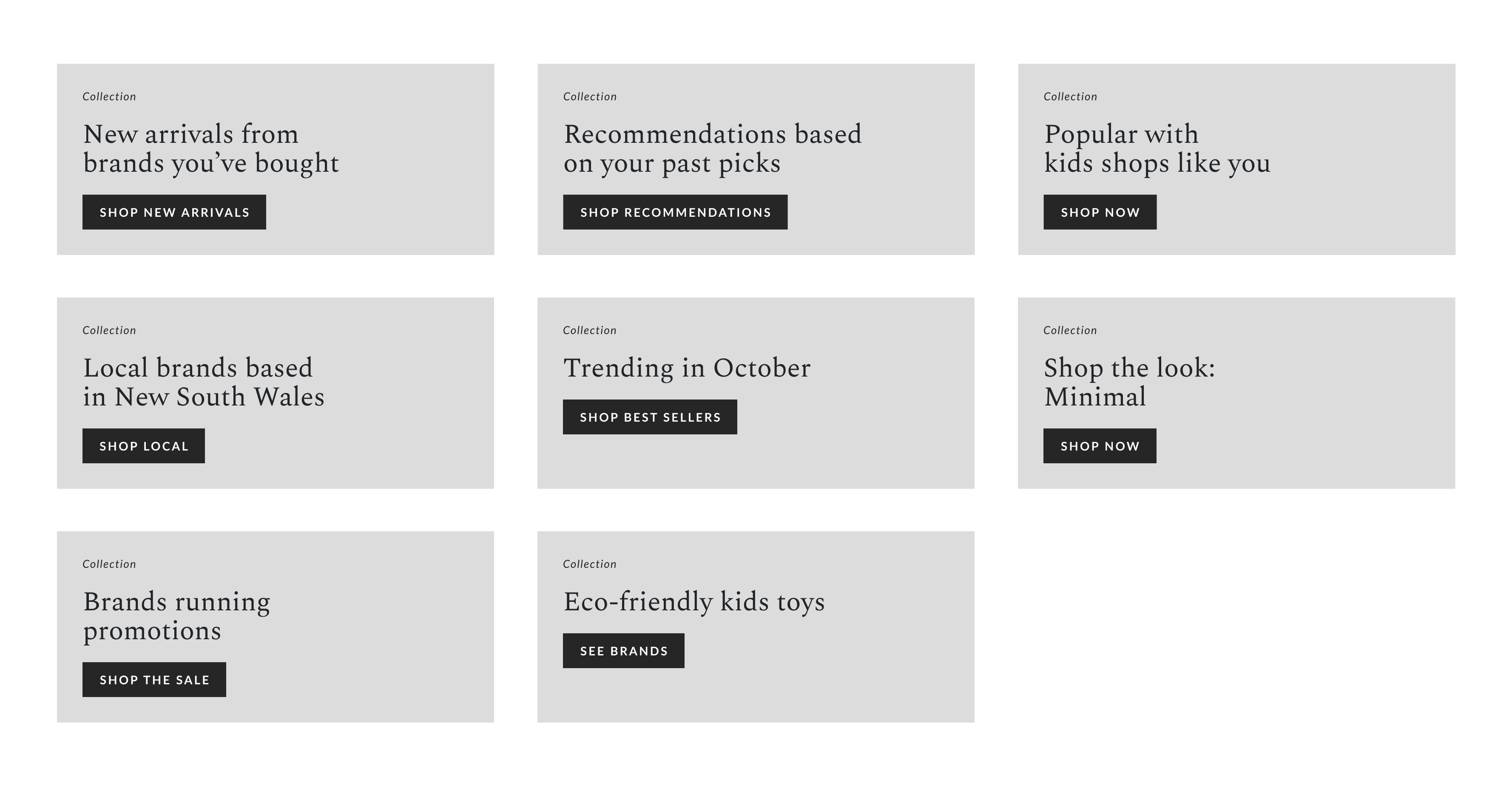
Testing personalized collections

We specifically wanted to know which personalized collections resonate with our users. To test this, we showed users 8 collection ideas and asked which 3 they’d click on. We wanted to strip down to the idea itself so we showed them without thumbnails, and researched each business prior to the call so we can really personalize the options we show to their business.
04 Results
What worked: Collections related to location resonated the most. Retailers in Trada prefer to source products locally. Additionally, just having more variety in terms of how products are presented (e.g. subcategories and personalized collections in carousels) enhanced the discovery experience.
What didn’t work: Some ideas needed further development such as the Curated picks (“who are the experts curating this?”) and Trending searches (“is it trending only on Trada or in social media?”)
Overall, it was a fun and productive one week, with some ideas that the team can start to build, and others that need some more exploration.